Why Your Wi-Fi QR Code Feels Hard to Use
Your Wi-Fi QR code may work perfectly and still be frustrating to use. Learn how size, placement, contrast, lighting, and simple instructions affect the scanning experience.
A Wi-Fi QR code can be technically perfect and still be annoying in real life.
- The QR Code Isn't the Whole Experience
- Size Matters More Than You Think
- Give the Code Some Breathing Room
- Don't Make People Hunt for the Wi-Fi
- Contrast Beats Fancy Design
- Lighting Can Ruin a Perfect Setup
- Put It Where the Wi-Fi Question Happens
- Keep a Backup for People Who Can't Scan
- Test It Like a Stranger
- A Better Wi-Fi QR Is Often a Simpler One
That sounds contradictory, but think about the last time you saw a tiny QR code stuck behind a counter, printed on a dark sign, or placed somewhere that required you to lean over another person's table just to scan it. The code itself may have been generated correctly. The problem was everything around it.
That distinction matters. A useful Wi-Fi QR code isn't just something that a phone can decode. It is something a person can spot, understand, scan, and use without having to ask, “Where am I supposed to point my camera?”
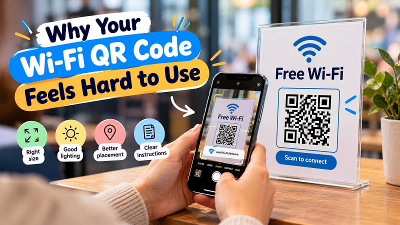
The QR Code Isn't the Whole Experience
When people create a Wi-Fi QR code, the natural instinct is to focus on the code itself. Is the network name correct? Is the password correct? Does the phone recognize it?
Those things obviously matter. But once the QR works, the next challenge is making the interaction effortless.
Imagine walking into a small guesthouse. You see a beautifully designed sign on the desk, but the Wi-Fi QR code is only two centimeters wide. You can barely frame it with your phone camera. Or perhaps the code is large enough, but the sign has a busy background that makes the pattern difficult to distinguish.
Nothing is technically broken. Yet the user experience is bad.
This is why a kode qr wifi should be treated more like a small piece of signage than just a generated image. People need to know what it is, where to scan it, and what will happen next.
Size Matters More Than You Think
One of the easiest mistakes is making the QR code too small because it looks cleaner that way.
On a phone screen, a QR code can sometimes be surprisingly compact and still work. Printed materials are a different story. Viewing distance, lighting, printer quality, camera focus, and the size of the individual modules inside the QR all affect how comfortable scanning feels.
There is no universal magic size that works everywhere. A QR code sitting on a reception desk can be smaller than one mounted several feet away on a wall.
A simple rule makes more sense than obsessing over a single measurement: the farther people stand from the code, the larger the code should be.
If someone has to move their phone within a few inches of the sign to make it scan, the design probably needs another look.
Give the Code Some Breathing Room
QR codes need visual separation from the surrounding design.
That means the empty space around the outside edge isn't wasted space. It helps the camera recognize where the QR code begins and ends.
This becomes especially important when a QR is placed inside a poster, menu, tabletop sign, sticker, or branded graphic. Designers sometimes fill every available inch with logos, text, borders, decorative shapes, and promotional elements. The result may look impressive to a human eye but become visually noisy for a phone camera.
Let the QR breathe.
A clean area around the code often does more for usability than another decorative element ever could.
Don't Make People Hunt for the Wi-Fi
A surprisingly common design problem has nothing to do with scanning.
People simply don't know which QR code is the Wi-Fi QR code.
This happens when several codes appear on the same sign. One might open a website, another might lead to social media, and a third might connect to Wi-Fi. If there is no obvious label, visitors are left guessing.
A short instruction solves most of the problem:
Scan to connect to Wi-Fi
That's it. No paragraph required.
If there is a second action nearby, label that one clearly too. The goal isn't to explain QR technology. The goal is to remove hesitation.
Contrast Beats Fancy Design
There is a temptation to customize everything.
Rounded corners. Brand colors. Gradients. Photos behind the code. Decorative frames. A logo in the middle.
Some customization can work, but every visual change introduces another opportunity to make scanning harder.
For a Wi-Fi QR code, strong contrast and clear patterns should take priority over decoration. A simple dark pattern against a light background remains popular for a reason: phones can identify it easily.
If you want branding, add it around the QR rather than turning the QR itself into the main design experiment.
The coolest-looking QR code in the room isn't particularly useful if five people have to try scanning it before one phone finally recognizes it.
Lighting Can Ruin a Perfect Setup
You can test a QR code under bright office lighting and think everything is fine. Then put the same sign near a window and discover that glare makes it difficult to scan.
Glass surfaces can create reflections. Glossy paper can catch overhead lights. Outdoor signs can be affected by direct sunlight. Dark rooms create another set of problems.
This is why placement should be tested in the environment where people will actually use the QR.
Don't just ask, “Does it scan?”
Ask, “Does it scan from where a guest naturally stands?”
That second question is much more useful.
Put It Where the Wi-Fi Question Happens
Location can make a bigger difference than design.
If guests usually ask for Wi-Fi when they sit down, putting the QR somewhere near the seating area makes sense. If people connect when they check in, reception may be the natural location. In a small office, a meeting room entrance or shared workspace may work better than putting the QR next to the printer where nobody thinks to look.
The best location isn't necessarily the most visible wall.
It is the place where the user naturally thinks, “I need internet now.”
That's a small UX principle, but it makes the whole interaction feel much more intentional.
Keep a Backup for People Who Can't Scan
QR codes are convenient, but they shouldn't become the only way to access the network.
Some people may have an older phone. Someone's camera may not recognize the code immediately. A device could have restrictions that make automatic Wi-Fi setup less straightforward. And sometimes a guest simply prefers typing the details manually.
You don't need to print the password in giant letters underneath the QR.
A small fallback such as the Wi-Fi network name and a clearly marked password can be enough. For public-facing locations, a separate guest network is often preferable to exposing credentials for the main network.
The point is flexibility. A good setup gives people a quick route and a backup route.
Test It Like a Stranger
Here's the test that catches a lot of problems: stop testing your own QR code like its creator.
Instead, approach it as if you've never seen it before.
Can you immediately tell what it does? Can you see it from a normal standing or sitting position? Is the code large enough? Is there enough empty space around it? Does the surrounding design distract you? Do you know what to do after scanning?
Better yet, hand the sign to someone who wasn't involved in creating it and say nothing.
Watch what they do.
If they immediately point their phone at the code, you're on the right track. If they ask where to scan, whether they need a special app, or which network they should choose, you've just discovered exactly what needs improving.
A Better Wi-Fi QR Is Often a Simpler One
There is no need to turn Wi-Fi access into a mini design project.
The most effective setup is usually pretty boring: a QR code that's large enough to scan comfortably, strong contrast, enough empty space around it, a short instruction, sensible placement, and a backup option for manual connection.
That's the sweet spot.
The technology does the complicated part behind the scenes. Your job is simply to make the human side of the interaction obvious.
And when someone walks in, sees the sign, scans it, and gets connected without asking a single question, that's when you know the setup is doing its job.