Why Wi-Fi QR Codes Get Ignored Even When They Work
Your Wi-Fi QR code works, but people still ask for the password. Learn why users ignore QR codes and how clearer context can improve Wi-Fi connections.
You put a Wi-Fi QR code on the counter. It is clearly visible. The QR works. The phone recognizes it. The network is online. Everything should be fine.
- The QR Code Is There. Nobody Uses It.
- People Need a Reason to Scan
- Timing Can Make or Break Adoption
- A Familiar Habit Can Beat a Better Method
- Don't Make Users Wonder Which Network They Are Joining
- Too Many Choices Can Make a Simple Connection Feel Complicated
- Watch What People Do Without Helping Them
- The Best Wi-Fi QR Experience Barely Feels Like an Experience
And yet, five minutes later, someone walks up and asks, “What’s the Wi-Fi password?”
It is an oddly common situation. The technology is doing exactly what it is supposed to do, but the human being standing in front of it simply chooses not to use it. That tells us something important: a useful Wi-Fi QR code is not only a technical object. It is also a communication tool. If people do not understand what they are looking at, when they should use it, or what will happen after they scan it, even a perfectly functional QR code can become background decoration.
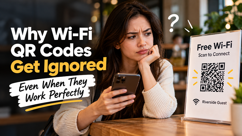
The QR Code Is There. Nobody Uses It.
The first problem may have nothing to do with scanning.
People are constantly surrounded by QR codes. Menus, payments, promotions, tickets, product information, event check-ins — the little black-and-white square has become visual wallpaper. That creates an interesting problem for Wi-Fi QR codes: simply displaying one does not automatically tell someone that it is relevant to them.
Imagine walking into a café and seeing a QR code beside the register with no explanation. Is it the menu? A loyalty program? A payment page? A social media account? A Wi-Fi connection? Unless the surrounding message answers that question, the user has to stop and figure it out.
Most people will not.
A small label such as “Free Wi-Fi — Scan to Connect” can completely change the interaction because it removes the guesswork. The QR code does not need to shout for attention. It simply needs to explain itself.
People Need a Reason to Scan
There is a subtle difference between seeing a QR code and being invited to scan one.
“Wi-Fi” is information. “Scan to connect to Wi-Fi” is an instruction.
That distinction matters because users generally do not want another tiny puzzle to solve. They are sitting down, opening a laptop, checking a message, starting a meeting, ordering food or settling into a hotel room. Connecting to the internet is usually a means to an end, not the activity they came for.
The faster the purpose becomes obvious, the less mental effort the user needs to spend.
This is why a Wi-Fi QR display works better when the message around it answers three basic questions almost instantly: What is this? What should I do? What happens next?
A simple structure can be enough:
FREE WI-FI
Scan to connect
Network: Riverside Guest
No dramatic graphics. No giant paragraph. No technical lecture. Just enough information to turn an anonymous QR code into an obvious next step.
Timing Can Make or Break Adoption
Another reason people ignore Wi-Fi QR codes is timing.
A QR code placed somewhere users rarely look may technically be accessible, but accessibility is not the same thing as usefulness. Think about the moments when someone actually wants Wi-Fi: when they arrive, sit down, check in, start working, join a meeting or discover that their mobile connection is unreliable.
If the QR code appears at that moment, it has a job to do.
If users only discover it later, after they have already asked an employee for the password, the opportunity has largely disappeared.
This is why the same QR code can perform very differently in two locations. One might sit quietly on a wall where nobody notices it. Another might appear directly where people naturally look when they first need to get connected.
The lesson is not “put your QR code everywhere.” That usually creates visual clutter. The better approach is to think about the moment of need and make the QR available there.
A Familiar Habit Can Beat a Better Method
Here is the slightly annoying part: people often repeat the method they already know.
If customers have always asked a staff member for the Wi-Fi password, many will continue doing exactly that even after a QR code appears nearby. They are not necessarily rejecting the QR. They simply have an established routine.
The same thing happens in offices, guest houses, classrooms and events. Someone asks, “What's the Wi-Fi?” Another person answers with the network name and password. The conversation ends. The QR code remains untouched.
Changing that behavior requires a small shift in the surrounding experience.
For example, instead of making the QR code a secondary detail, the first response can become:
“The Wi-Fi QR is right here — just scan it.”
After enough repetition, users begin to recognize the new path without needing an explanation.
This is a useful reminder for businesses: introducing a tool and changing a behavior are two different jobs.
Don't Make Users Wonder Which Network They Are Joining
Confusion can also kill adoption.
Some locations have multiple networks: a private staff network, a guest network, a separate event network, or different connections for different areas. In those environments, a QR code without context can create another question:
“Which Wi-Fi is this?”
That is exactly the kind of hesitation that makes someone fall back to asking a person.
Showing the network name alongside the QR can help. It gives users something concrete to recognize before they scan. If the network is called “Hotel-GUEST,” for example, seeing that name next to the QR makes the purpose much clearer than presenting an isolated graphic.
The same principle applies to sharing a qr wifi password manually. The useful information is not just the password itself; the user needs to know which network it belongs to.
Clarity beats cleverness here.
Too Many Choices Can Make a Simple Connection Feel Complicated
There is another trap: trying to provide every possible option on one sign.
A single Wi-Fi display might include several network names, two QR codes, a password, a website address, instructions for Android, instructions for iPhone and a few lines explaining what to do if something goes wrong.
Technically, that may be comprehensive.
From a user's perspective, it can feel like a mini instruction manual.
When the goal is simply getting online, the display should have a clear primary action. If the guest network is the intended option, make that option obvious. If manual connection is available as a backup, keep it secondary rather than competing with the main action.
A good Wi-Fi QR experience does not try to teach the user everything. It gives them the shortest sensible route to being connected.
Watch What People Do Without Helping Them
Want to know whether a Wi-Fi QR setup actually works for humans?
Do not explain it.
Watch someone who has never seen the setup before.
Can they tell what the QR is for? Do they immediately understand what to do? Do they look around for a password? Do they ask another person for help? Do they scan it but hesitate afterward?
These reactions are more useful than assuming that the design works because the QR itself scans correctly.
You can even make this a tiny real-world test. Change the wording around the QR, observe what happens, then compare the number of people who still ask for the password.
The goal is not to turn Wi-Fi into a laboratory experiment. It is simply to notice the gap between “the QR works” and “people use the QR.”
That gap is where most of the interesting UX problems live.
The Best Wi-Fi QR Experience Barely Feels Like an Experience
Nobody wants to think about connecting to Wi-Fi.
That is actually good news.
It means the ideal setup does not need to be flashy. It needs to disappear into the user's routine. They arrive, notice the Wi-Fi sign, understand that the QR is for connecting, scan it and move on with whatever they were trying to do in the first place.
No awkward conversation. No searching through a long password. No wondering which QR code belongs to which network.
The technology becomes almost invisible because the communication around it does the heavy lifting.
That is the difference between a QR code that merely works and one that actually gets used.
So if people keep asking for the Wi-Fi password even though there is a perfectly good QR code sitting right in front of them, do not immediately blame the QR itself. Look at the experience around it.
Maybe people cannot tell what it does. Maybe they do not notice it at the right moment. Maybe the network name is unclear. Maybe the old habit of asking someone for the password is simply stronger.
Fix that layer, and the QR code finally gets a chance to do what it was designed to do: get people online without making them think about how they got there.